Coursera Website Redesign
Enabling Students to Learn More Effectively
Coursera Website Redesign
Background
Coursera is an e-learning platform, with the mission to provide universal access to world-class learning, bridging the gap between education and employment.
Challenge
How might we improve the user experience that students have on Coursera’s website, such that it is more conducive to learning?
User
Students between the ages of 18-35, wanting to supplement their studies through online learning.
Duration
2.5 Months
Roles
My Role
UX/UI Designer & UX Researcher
Collaborator
UX Writer
Tools
Figma
Miro
Pen and Paper
My Responsibilities
Testing Assumptions
Journey Mapping
Data Analysis
Affinity Mapping
Empathy Mapping
Ideation
Impact-Effort Matrix
User ows
Wireframe Sketching
Low-Fidelity Prototyping
High-Fidelity Prototyping
Usability Testing
Interactive Prototyping
UX/UI Design
Business Goals
Market Research
Design Approach
What is Coursera? What is Their Mission?
Coursera is an e-learning platform, with the mission to provide universal access to world-class learning. Bridging the gap between education and employment through elite academic and professional certifications.
Why Online Learning?
While online learning presents unique challenges, student demand for it is rising. A Chronicle of Higher Education survey found that over 50% of students now prefer virtual or hybrid models, as institutions adapt to a tech-centric landscape.
Student expectations are also shifting towards more remote learning options
Students are optimistic about colleges delivering high-quality online courses for a tech-driven future
Over 50% of respondents prefer either an all-virtual or hybrid learning experience
Higher Expectations For Virtual Learning Pose As A Challenge
With student’s now expecting more from their online learning experience, meeting those expectations to support their growth can be challenging.

This creates the necessity to explore effective strategies to adequately support student growth.
Why Redesign Coursera's Website?
While accessibility to learning is key to Coursera’s mission, effective learning strategies are essential to truly support student success at scale.
I conducted a competitive analysis, comparing Coursera’s website to three of its’ competitors, SkillShare, Khan Academy, and Udemy, focusing on four main criteria, which were crucial for evaluating the user experience:
Competitors
• SkillShare
• Khan Academy
• Udemy
Criteria
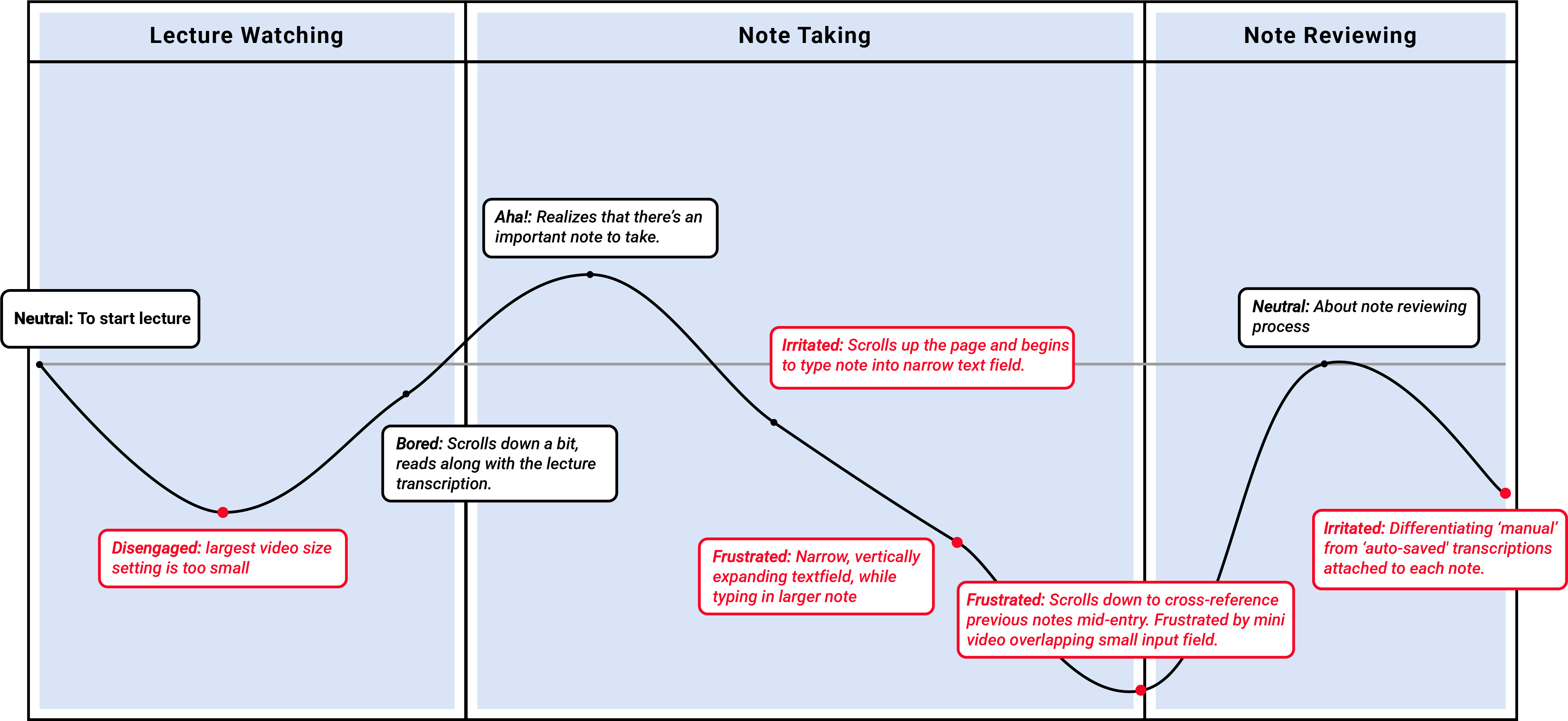
• Lecture Watching Experience
• Note Taking Experience
• Note Reviewing Experience
• UI
Coursera ranked 3ed, based on the criteria, and given their mission to provide universal access to learners, and being a ‘professional bridge’, it makes it that much more important to improve Coursera’s website.
Here are 3 Opportunities:
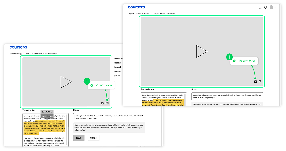
1. Optimize Video & Viewing Modes
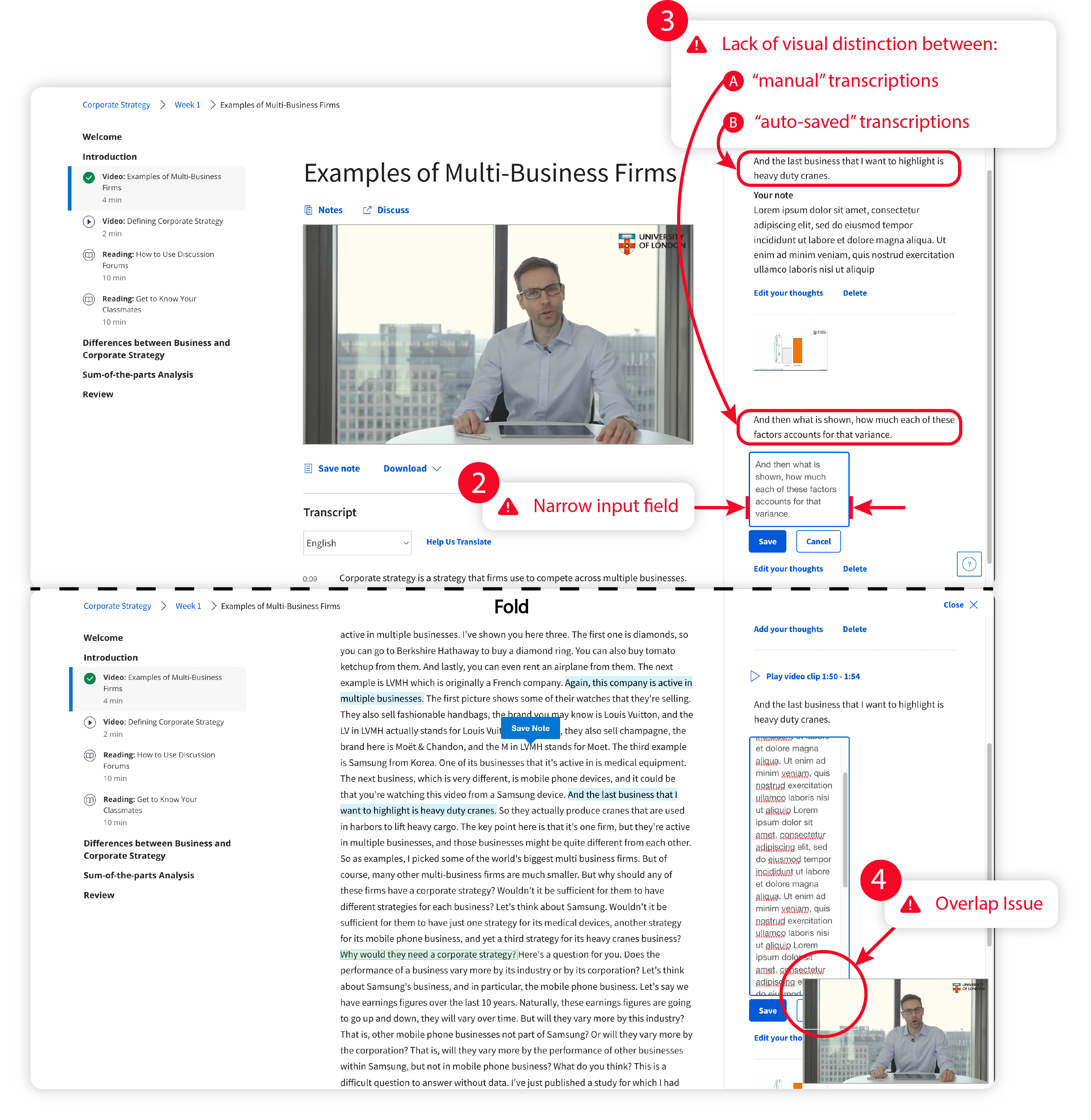
Coursera’s two video options fall short of industry standards: the large view lacks immersive scale, while UI overlap in the minimized version disrupts note-taking.
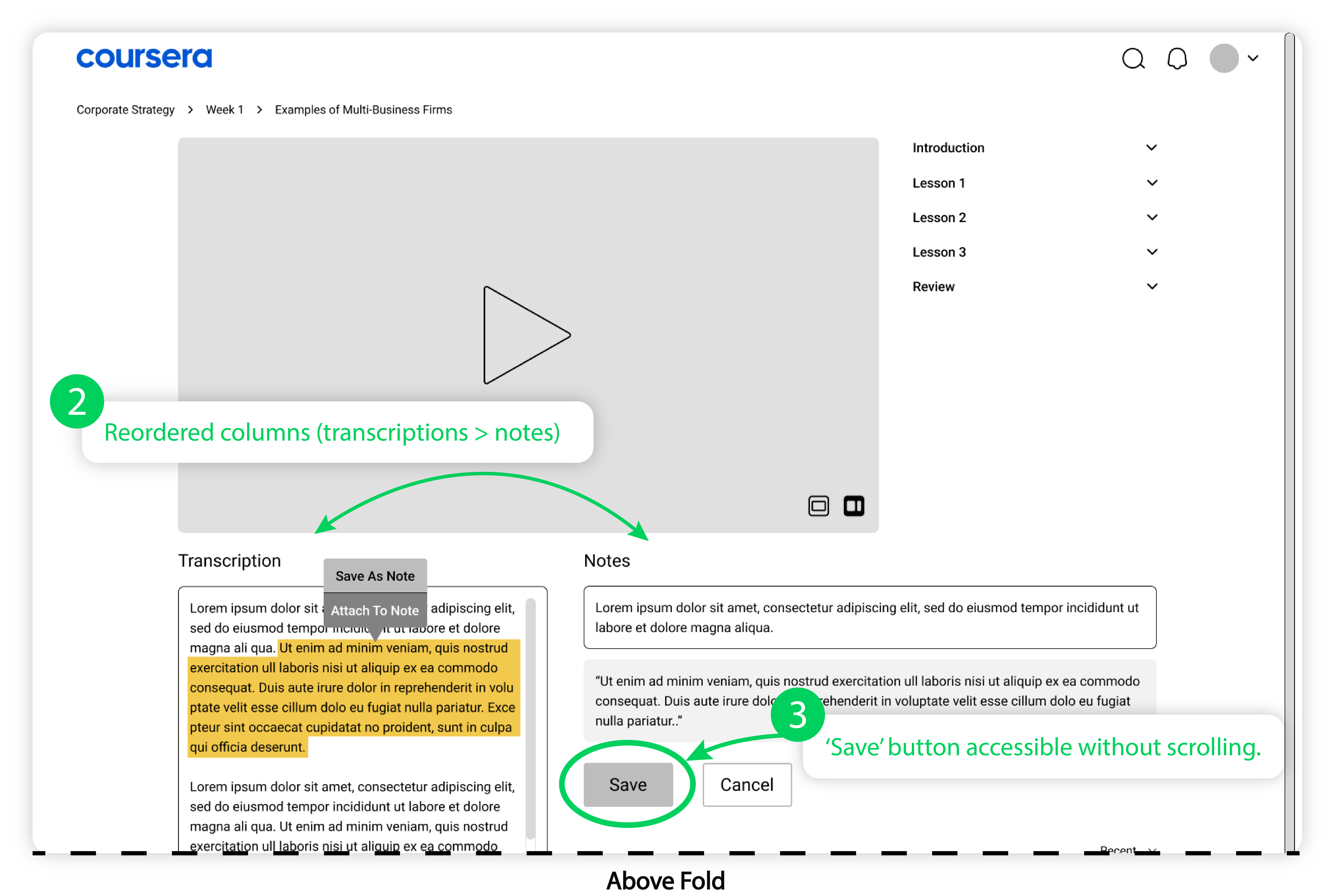
2. Unified Workspace Integration
The second opportunity is to create a seamless digital notebook that integrates note-taking and review tools into a single, friction-free interface. (Currently separate pages).
3. Modernizing UI & Visual Hierarchy
Finally, the “Look and Feel” of competitor sites were more modern and had better content layout, so refreshing the UI could make it more appealing to new and existing learners.
Key Problem Assumptions
I focused on testing the three core experiences:
1.) Lecture Watching
2.) Note Taking
3.) Note Reviewing
User Research Goals
Before diving into usability testing, I prepared some questions to establish key learning objectives, to challenge assumptions and surface any issues.
Usability Questions Should Help To:
• Gauge user engagement with the current lecture watching experience
• Identify user pain points with note-taking
• Uncover any confusion during note reviewing
• Identify new pain points
Business Goals
While the core experiences drive user value, they are also designed to deliver on key business goals, such as engagement, adoption and conversion.
Who is Our Target User?
Sarah / 22 / Business Administration Student
• She manages a busy school schedule while engaging in supplemental learning through online courses.
• She often finds it challenging to stay on track with her academic goals, especially when her studies become tedious.
Usability Testing
With the usability questions prepared, I then proceeded to conduct the usability test, which involved:
• Presenting the user with the Coursera website on a laptop
• Assigning specific tasks, along with follow-up questions, to gather insights on their experiences
• Using the “Think Aloud” method to collect qualitative data during the testing process
Lecture Watching Experience (Problem)
Context
Three-column interface with the compressed video, sitting between the playlist and notes panel.
Problem
The three-column layout could compromise engagement and learning effectiveness.
Key Insights
• One key insight revealed that users found the experience underwhelming and craved more of a "theatre experience”.
• They also requested a collapsible playlist in order to maximize screen space.
Note Taking Experience (Problem)
Context
User’s can watch the lecture via a mini-player while scrolling, take notes from anywhere on the page and follow along with the transcript, below the fold.
Problem
The issue arises when the input field expands vertically, as users type in larger notes, compromising readability.

Not only that, but the mini video can end up overlapping and obstructing the user’s view of the input field, making it that much more difficult to type in a note.
Key Insights
• Unsurprisingly, users found the narrow note input field to be significantly frustrating and needed more space.
• Another key issue was the unclosable mini-player, obstructing the input area, with a user suggesting to relocate the mini video over the playlist, to improve usability.
Note Reviewing Experience (Problem)
Context
Currently, notes default to including real-time transcriptions, unless a specific snippet is manually selected.
Problem
Users struggle to distinguish between "auto-saved" and "manually saved” transcriptions, which makes reviewing notes mentally taxing.
Key Insights
• Users actually faced two distinct layers of confusion: distinguishing between “notes” from “transcriptions”; navigating the ambiguity between “auto-saved” and “manually-saved” transcriptions.
• These layers of friction highlight a clear need for more intuitive categorization and saving protocols.
• Adding a user-suggested, ”Save transcription” checkbox during the saving process could give users more control over their notes.
Empathy Mapping
I synthesized usability test insights into an empathy map to visualize user behaviors and attitudes, to better understand their core needs and challenges.
Affinity Mapping
Grouping insights chronologically, allowed me to pinpoint the specific stages of the user journey where friction was most intense.
Priorities
After that, I ranked and prioritized specific issues to focus on, with the high priority issues being making the main video larger and the input field wider.

And medium priority issues being, the auto-transcription saving problem, and the overlap issue between the mini video and input field.
Experience Map
I synthesized empathy and affinity mapping data into an experience map to visualize the emotional highs and lows of the user journey.
User Stories
To illustrate the value of this redesign, I’ve developed three user stories centered on the core learning journey.

These focus on deepening lecture engagement, streamlining note-taking, and eliminating the friction of tedious reviews to protect student motivation and time.
User Stories
“I need the lecture watching experience to be immersive, to maintain focus and academic progress”.
“I want a simple note-taking method to capture essential information, efficiently”.
“I don’t want to spend extra time tediously reviewing notes because I don’t want it to hinder my motivation and time management”.
Challenge
How might we improve the user experience that students have on Coursera's website, such that it is more conducive to learning?
Brainstorming Ideas
For brainstorming, I identified specific pain points across lecture watching, note-taking, and reviewing, pairing each with targeted suggestions — highlighting the most promising solutions with red dots.
Impact Effort Matrix
I plotted the ideas on an impact/effort matrix, prioritizing high-impact, low-effort solutions in the top-right quadrant to optimize resource allocation.
Wireframe Sketches
We’ll discuss the refinements based on the top initial concepts and wireframe feedback.
Low-Fidelity Prototype
Lecture Watching Experience (Before/After)
Issue
Scale limitations make the largest video size too small leading to a suboptimal viewing experience.
Changes
Improved layout flexibility with larger video options for a more immersive and engaging lecture experience.
Note Taking Experience
Before
Issues
Restricted Input Field: The narrow, vertically expanding text area compromises readability as note length increases.
Transcription Ambiguity: A lack of visual distinction between manual and auto-saved transcriptions complicates the review process.
UI Congestion: The mini video player overlaps the input field, obstructing the user's workspace and hinders interaction.
After (2-Pane View)
V1 Changes
Wider input field
Optional transcription saving feature. New tooltip feature allows users to clip transcription segments into their notes.
V2 Changes
Reordered columns (Transcriptions > Notes)
‘Save’ button accessible without scrolling.
After (Theatre View - Pro's and Con's)
Pros and Cons
Pros: The “theatre view” provides a larger video than the 2-pane view, and still makes it possible for note taking above the fold. 
Cons: Notes with transcriptions added can push saving features below the fold, requiring users to scroll further in order to access them.
After (Below Fold)
V1 Changes
Overlapping issue resolved
V2 Changes
Repositioned the mini video for better visual hierarchy.
Removed redundant scroll bar to improve navigation, and anchored transcription column, so it's easier to take notes without losing your place.
Note Reviewing Experience (Before)
Before (Main Page and Notes Page)
Issues:
• Primary Problem: Weak 'Your Note' labeling makes it hard to distinguish notes from transcriptions.


• Secondary Problem: The separate notes page disrupts the user flow between lecture content and note-taking.
After (Main Page)
Changes
Differentiated notes from transcriptions with clearer labeling, for easier scanning.

Merged lecture and note views to eliminate page-switching friction.
High-Fidelity Prototype
Lecture Watching Experience
Provides students with a more immersive lecture watching experience, with better layout flexibility, to deepen lecture engagement and academic progress.
Features
Improved layout flexibility with a larger video screen, for a more immersive experience.
Note Taking Experience
Optimized note-taking layout for speed and focus.
Features
• Prioritized Core Tools: Scaled video and ensured saving tools were easily accessible.
Resolved UI Friction: Repositioned the mini-video and improved hierarchy to fix layout overlaps.
Streamlined Flow: Reordered columns (Transcriptions > Notes), with optional transcription saving, to mirror the user’s natural workflow.
Enhanced Navigation: Anchored the transcription column and removed redundant scrolling to preserve focus.
Note Reviewing Experience
Clear distinction between "notes" and "transcriptions". Merged lecture and note views to eliminate page-switching friction.
Features
• Differentiated notes from transcriptions for easier scanning.
Merged lecture and note views to eliminate page-switching friction.
Reflections
Note-Taking Enhancements
• Seamless Note-Saving: To improve accessibility, standardize the note tools to appear above the fold in both Two-Pane and Theatre views. (Right now, users must scroll to access note tools in Theatre view).
• Content Management: Integrate Edit/Delete options for notes and transcriptions, for better data management.
Note Review & Feedback
• Lesson Filters: Propose a "Filter by Lesson" feature to streamline note retrieval.
• Expand Testing: Aim for additional usability rounds beyond the initial three to further refine the experience.

Want to work together?

If you like what you see and want to work together, get in touch!